Simon shows his Times Tables Visualization in Processing (Java) and talks about how it’s connected to Mandelbrot Set. See the code with the README on GitHub: https://github.com/simon-tiger/times_tables
View the full animation here:
Simon writes: This is a visualization for the times tables from 1 to 200 (including the in-between numbers that are multiples of .01). I used modular arithmetic to write the code:
0. Start with a circle with 200 points (I’ve chosen 200, your number could be anything, but we’ll use 200 in the instructions).
1. Label the points from 0-199, then from 200-399, then from 400-599, and so on (you’re labeling the same point several times).
2. We’ll first do the 2x table. 2×0=0, same thing so we don’t do anything. 2×1=2, so we connect 1 to 2. 2×2=4, so we connect 2 to 4, and so on.
3. 2×100=200, where’s the 200? It goes in a circle so 200 is where the 0 is, and now you can keep going.
4. Now you could keep going beyond 199, but actually, you’re going to get the same lines you already had!
5. You can now create separate images for the 2x table (which we’ve just done), the 3x table, the 4x table, the 5x table, and so on. You can even try in-between numbers (like 2.53) if you want.
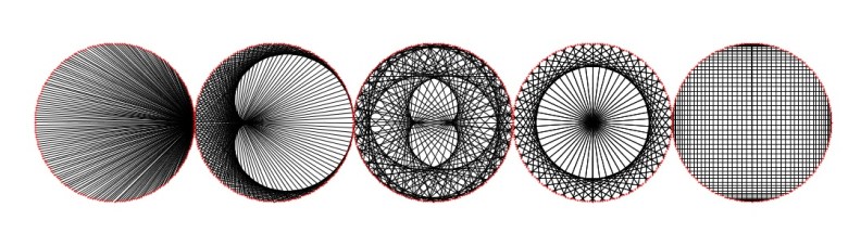
In the program, you see an animated image at the left of the screen, and 4 static images (representing examples of times tables) to the right of that. They represent the 2x, 34x, 51x and 99x tables.
The idea of a times tables visualization comes from a video by Mathologer, but the code Simon wrote completely on his own.

Awesome work simon! Keep it up!
LikeLike